← Back to Portfolio

Vanta Ridge - Conversion Review
Vanta Ridge had a solid offer and paid traffic coming in, but too many users were leaving before taking the next step. They needed a practical audit that showed where the friction lived and what to fix first.
-33% drop-off
Overview
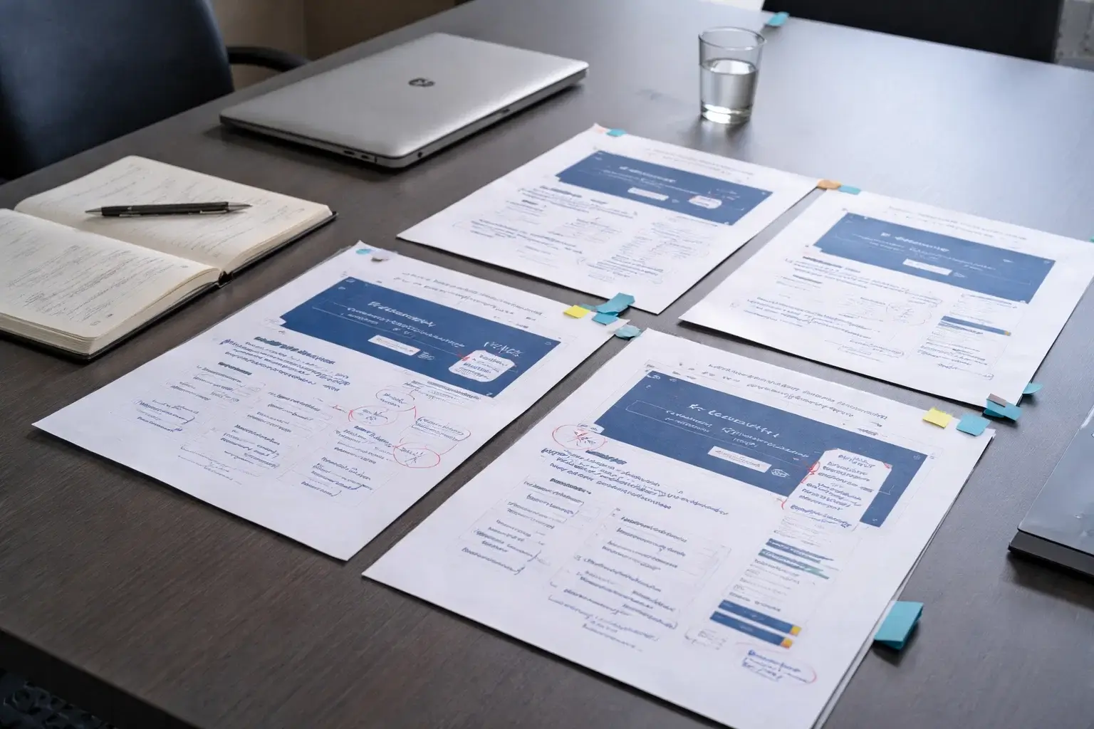
The landing page had multiple trust and clarity issues: weak above-the-fold hierarchy, scattered call-to-action logic, and too much cognitive load on mobile. The project focused on identifying the biggest usability and conversion blockers and turning them into a prioritised action plan.
What we did
- Reviewed the page from a UX, hierarchy, and conversion perspective
- Assessed mobile friction, trust signals, and CTA placement
- Annotated the most problematic sections with clear recommendations
- Benchmarked the page flow against stronger fintech landing patterns
- Built a prioritised fix list split into quick wins and structural changes
Deliverables
28-Point Audit PDF
Annotated Screenshots
Priority Matrix
CTA Recommendations
Mobile UX Notes
Quick-Win Checklist
Outcome
A clearer improvement roadmap that helped reduce landing-page drop-off and made the demo journey easier to understand.

Have a similar project in mind?
Share your brief — we’ll help you choose the right service and tokens plan.